1 前言
前面章节介绍了如何ArkTS语言UI范式-基础语法(一)。了解了自定义组件的创建与使用,本章节我们来学习下UI相关的装饰器。
uilder_3">2 @Builder装饰器
@Builder装饰器是自定义构建函数,ArkUI中提供了一种更轻量的UI元素复用机制@Builder,@Builder所装饰的函数遵循build()函数语法规则,开发者可以将重复使用的UI元素抽象成一个方法,在build方法里调用。
为了简化语言,我们将@Builder装饰的函数也称为“自定义构建函数”。
2.1 自定义组件内自定义构建函数
// 定义
@Builder MyBuilderFunction() { ... }

// 使用
this.MyBuilderFunction()
自定义组件内可以定义多个@Builder方法,对该组件私有、不允许组件外调用,通过this访问自定义组件的状态变量而不是参数传递。
2.2 全局自定义构建函数
// 定义
@Builder function MyGlobalBuilderFunction() { ... }

// 使用
MyGlobalBuilderFunction()
全局的自定义构建函数可以被整个应用获取,不允许使用this和bind方法。如果不涉及组件状态变化,建议使用全局的自定义构建方法。
2.3 参数传递规则
自定义构建函数的参数传递有按值传递和按引用传递两种,均需遵守以下规则:
- 参数的类型必须与参数声明的
类型一致,不允许undefined、null和返回undefined、null的表达式。 - 在
@Builder修饰的函数内部,不允许改变参数值。 @Builder内UI语法遵循UI语法规则。- 只有传入一个参数,且参数需要直接传入对象字面量才会按引用传递该参数,其余传递方式均为按值传递。
2.4 按引用传递参数
按引用传递参数时,传递的参数可为状态变量,且状态变量的改变会引起@Builder方法内的UI刷新。ArkUI提供$$作为按引用传递参数的范式。
class ABuilderParam {
  paramA1: uiltin">string = ''
  paramB1: uiltin">string = ''
}

@Builder function ABuilder($$ : ABuilderParam) {...}


class ABuilderParam {
  paramA1: uiltin">string = ''
}

@Builder function ABuilder($$: ABuilderParam) {
  Row() {
    Text(`UseStateVarByReference: ${$$.paramA1} `)
  }
}
@Entry
@Component
struct Parent {
  @State label: uiltin">string = 'Hello';
  build() {
    Column() {
      // 在Parent组件中调用ABuilder的时候,将this.label引用传递给ABuilder
      ABuilder({ paramA1: this.label })
      Button('Click me').onClick(() => {
        // 点击“Click me”后,UI从“Hello”刷新为“ArkUI”
        this.label = 'ArkUI';
      })
    }
  }
}
2.5 按值传递参数
调用@Builder装饰的函数默认按值传递。当传递的参数为状态变量时,状态变量的改变不会引起@Builder方法内的UI刷新。所以当使用状态变量的时候,推荐使用按引用传递。
@Builder function ABuilder(paramA1: uiltin">string) {
  Row() {
    Text(`UseStateVarByValue: ${paramA1} `)
  }
}
@Entry
@Component
struct Parent {
  @State label: uiltin">string = 'Hello';
  build() {
    Column() {
      ABuilder(this.label)
    }
  }
}
uilderParam_99">3 @BuilderParam装饰器
@BuilderParam装饰器是引用@Builder函数。当开发者创建了自定义组件,并想对该组件添加特定功能时,例如在自定义组件中添加一个点击跳转操作。若直接在组件内嵌入事件方法,将会导致所有引入该自定义组件的地方均增加了该功能。为解决此问题,ArkUI引入了@BuilderParam装饰器,@BuilderParam用来装饰指向@Builder方法的变量,开发者可在初始化自定义组件时对此属性进行赋值,为自定义组件增加特定的功能。该装饰器用于声明任意UI描述的一个元素,类似slot占位符。
uilderParam_101">3.1 初始化@BuilderParam装饰的方法
@BuilderParam装饰的方法只能被自定义构建函数(@Builder装饰的方法)初始化。
使用所属自定义组件的自定义构建函数或者全局的自定义构建函数,在本地初始化@BuilderParam。
@Builder function GlobalBuilder0() {}

@Component
struct Child {
  @Builder doNothingBuilder() {};

  @BuilderParam aBuilder0: () => void = this.doNothingBuilder;
  @BuilderParam aBuilder1: () => void = GlobalBuilder0;
  build(){}
}
用父组件自定义构建函数初始化子组件@BuilderParam装饰的方法。
@Component
struct Child {
  @Builder FunABuilder0() {}
  @BuilderParam aBuilder0: () => void = this.FunABuilder0;

  build() {
    Column() {
      this.aBuilder0()
    }
  }
}

@Entry
@Component
struct Parent {
  @Builder componentBuilder() {
    Text(`Parent builder `)
  }

  build() {
    Column() {
      Child({ aBuilder0: this.componentBuilder })
    }
  }
}
需注意this指向正确。
以下示例中,Parent组件在调用this.componentBuilder()时,this指向其所属组件,即“Parent”。@Builder componentBuilder()传给子组件@BuilderParam aBuilder0,在Child组件中调用this.aBuilder0()时,this指向在Child的label,即“Child”。对于@BuilderParam aBuilder1,在将this.componentBuilder传给aBuilder1时,调用bind绑定了this,因此其this.label指向Parent的label。使用bind改变函数调用的上下文,可能会使this指向混乱。
@Component
struct Child {
  label: uiltin">string = `Child`

  @Builder
  FunABuilder0() {}

  @Builder
  FunABuilder1() {}

  @BuilderParam aBuilder0: () => void = this.FunABuilder0;
  @BuilderParam aBuilder1: () => void = this.FunABuilder1;

  build() {
    Column() {
      this.aBuilder0()
      this.aBuilder1()
    }
  }
}

@Component
struct Parent {
  label: uiltin">string = `Parent`

  @Builder
  componentBuilder() {
    Text(`${this.label}`)
  }

  build() {
    Column() {
      this.componentBuilder()

      Child({
        // 这里是当Child的build调用时才调用this.componentBuilder
        // 所以this.label指向Child内的
        aBuilder0: this.componentBuilder,
        // 调用bind绑定了this,因此其this.label指向Parent的label。
        // 可以理解为这里是先调用this.componentBuilder()那到值后再返回函数赋值给aBuilder1
        aBuilder1: (): void => {
          this.componentBuilder()
        }

      })
    }
  }
}

3.2 参数初始化组件
@BuilderParam装饰的方法可以是有参数和无参数的两种形式,需与指向的@Builder方法类型一致。
class Tmp{
label:uiltin">string = ''
}
@Builder function GlobalBuilder1($$ : Tmp) {
Text($$.label)
.width(400)
.height(50)
.backgroundColor(Color.Green)
}
@Component
struct Child {
label: uiltin">string = 'Child'
@Builder FunABuilder0() {}
// 无参数类,指向的componentBuilder也是无参数类型
@BuilderParam aBuilder0: () => void = this.FunABuilder0;
// 有参数类型,指向的GlobalBuilder1也是有参数类型的方法
@BuilderParam aBuilder1: ($$ : Tmp) => void = GlobalBuilder1;
build() {
Column() {
this.aBuilder0()
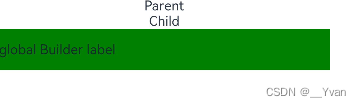
this.aBuilder1({label: 'global Builder label' } )
}
}
}
@Entry
@Component
struct Parent {
label: uiltin">string = 'Parent'
@Builder componentBuilder() {
Text(`${this.label}`)
}
build() {
Column() {
this.componentBuilder()
Child({ aBuilder0: this.componentBuilder, aBuilder1: GlobalBuilder1 })
}
}
}
3.3 尾随闭包初始化组件
在自定义组件中使用@BuilderParam装饰的属性时也可通过尾随闭包进行初始化。在初始化自定义组件时,组件后紧跟一个大括号“{}”形成尾随闭包场景。
- 此场景下自定义组件内有且仅有一个使用
@BuilderParam装饰的属性。 - 此场景下自定义组件
不支持使用通用属性。
开发者可以将尾随闭包内的内容看做@Builder装饰的函数传给@BuilderParam。示例如下:
// xxx.ets
@Component
struct CustomContainer {
  @Prop header: uiltin">string = '';
  @Builder CloserFun(){}
  @BuilderParam closer: () => void = this.CloserFun

  build() {
    Column() {
      Text(this.header)
        .fontSize(30)
      this.closer()
    }
  }
}

@Builder function specificParam(label1: uiltin">string, label2: uiltin">string) {
  Column() {
    Text(label1)
      .fontSize(30)
    Text(label2)
      .fontSize(30)
  }
}

@Entry
@Component
struct CustomContainerUser {
  @State text: uiltin">string = 'header';

  build() {
    Column() {
      // 创建CustomContainer,在创建CustomContainer时,通过其后紧跟一个大括号“{}”形成尾随闭包
      // 作为传递给子组件CustomContainer @BuilderParam closer: () => void的参数
      CustomContainer({ header: this.text }) {
        Column() {
          specificParam('testA', 'testB')
        }.backgroundColor(Color.Yellow)
        .onClick(() => {
          this.text = 'changeHeader';
        })
      }
    }
  }
}

4 @Styles装饰器
如果每个组件的样式都需要单独设置,在开发过程中会出现大量代码在进行重复样式设置,虽然可以复制粘贴,但为了代码简洁性和后续方便维护,我们推出了可以提炼公共样式进行复用的装饰器@Styles。
@Styles装饰器可以将多条样式设置提炼成一个方法,直接在组件声明的位置调用。通过@Styles装饰器可以快速定义并复用自定义样式。用于快速定义并复用自定义样式。
4.1装饰器使用说明
当前@Styles仅支持通用属性和通用事件。
@Styles方法不支持参数,反例如下。
// 反例: @Styles不支持参数
@Styles function globalFancy (value: uiltin">number) {
  .width(value)
}
@Styles可以定义在组件内或全局,在全局定义时需在方法名前面添加function关键字,组件内定义时则不需要添加function关键字。
// 全局
@Styles function functionName() { ... }

// 在组件内
@Component
struct FancyUse {
  @Styles fancy() {
    .height(100)
  }
}
定义在组件内的@Styles可以通过this访问组件的常量和状态变量,并可以在@Styles里通过事件来改变状态变量的值,示例如下:
@Component
struct FancyUse {
  @State heightValue: uiltin">number = 100
  @Styles fancy() {
    .height(this.heightValue)
    .backgroundColor(Color.Yellow)
    .onClick(() => {
      this.heightValue = 200
    })
  }
}
组件内@Styles的优先级高于全局@Styles。 框架优先找当前组件内的@Styles,如果找不到,则会全局查找。
4.2 使用场景
以下示例中演示了组件内@Styles和全局@Styles的用法。
// 定义在全局的@Styles封装的样式
@Styles function globalFancy() {
  .width(150)
  .height(100)
  .backgroundColor(Color.Pink)
}

@Entry
@Component
struct FancyUse {
  @State heightValue: uiltin">number = 100
  // 定义在组件内的@Styles封装的样式
  @Styles fancy() {
    .width(200)
    .height(this.heightValue)
    .backgroundColor(Color.Yellow)
    .onClick(() => {
      this.heightValue = 200
    })
  }

  build() {
    Column({ space: 10 }) {
      // 使用全局的@Styles封装的样式
      Text('FancyA')
        .globalFancy()
        .fontSize(30)
      // 使用组件内的@Styles封装的样式
      Text('FancyB')
        .fancy()
        .fontSize(30)
    }
  }
}
5 @Extend装饰器
在前文的示例中,可以使用@Styles用于样式的扩展,在@Styles的基础上,我们提供了@Extend,用于扩展原生组件样式。
5.1装饰器使用说明
语法
@Extend(UIComponentName) function functionName { ... }
使用规则
- 和
@Styles不同,@Extend仅支持在全局定义,不支持在组件内部定义。 - 和
@Styles不同,@Extend支持封装指定的组件的私有属性和私有事件,以及预定义相同组件的@Extend的方法。
// @Extend(Text)可以支持Text的私有属性fontColor
@Extend(Text) function fancy () {
  .fontColor(Color.Red)
}
// superFancyText可以调用预定义的fancy
@Extend(Text) function superFancyText(size:uiltin">number) {
    .fontSize(size)
    .fancy()
}
和@Styles不同,@Extend装饰的方法支持参数,开发者可以在调用时传递参数,调用遵循TS方法传值调用。
// xxx.ets
@Extend(Text) function fancy (fontSize: uiltin">number) {
  .fontColor(Color.Red)
  .fontSize(fontSize)
}

@Entry
@Component
struct FancyUse {
  build() {
    Row({ space: 10 }) {
      Text('Fancy')
        .fancy(16)
      Text('Fancy')
        .fancy(24)
    }
  }
}
@Extend装饰的方法的参数可以为function,作为Event事件的句柄。
@Extend(Text) function makeMeClick(onClick: () => void) {
  .backgroundColor(Color.Blue)
  .onClick(onClick)
}

@Entry
@Component
struct FancyUse {
  @State label: uiltin">string = 'Hello World';

  onClickHandler() {
    this.label = 'Hello ArkUI';
  }

  build() {
    Row({ space: 10 }) {
      Text(`${this.label}`)
        .makeMeClick(() => {this.onClickHandler()})
    }
  }
}
@Extend的参数可以为状态变量,当状态变量改变时,UI可以正常的被刷新渲染。
@Extend(Text) function fancy (fontSize: uiltin">number) {
  .fontColor(Color.Red)
  .fontSize(fontSize)
}

@Entry
@Component
struct FancyUse {
  @State fontSizeValue: uiltin">number = 20
  build() {
    Row({ space: 10 }) {
      Text('Fancy')
        .fancy(this.fontSizeValue)
        .onClick(() => {
          this.fontSizeValue = 30
        })
    }
  }
}
5.2 使用场景
以下示例声明了3个Text组件,每个Text组件均设置了fontStyle、fontWeight和backgroundColor样式。
@Entry
@Component
struct FancyUse {
  @State label: uiltin">string = 'Hello World'

  build() {
    Row({ space: 10 }) {
      Text(`${this.label}`)
        .fontStyle(FontStyle.Italic)
        .fontWeight(100)
        .backgroundColor(Color.Blue)
      Text(`${this.label}`)
        .fontStyle(FontStyle.Italic)
        .fontWeight(200)
        .backgroundColor(Color.Pink)
      Text(`${this.label}`)
        .fontStyle(FontStyle.Italic)
        .fontWeight(300)
        .backgroundColor(Color.Orange)
    }.margin('20%')
  }
}
@Extend将样式组合复用,示例如下。
@Extend(Text) function fancyText(weightValue: uiltin">number, color: Color) {
  .fontStyle(FontStyle.Italic)
  .fontWeight(weightValue)
  .backgroundColor(color)
}
通过@Extend组合样式后,使得代码更加简洁,增强可读性。
@Entry
@Component
struct FancyUse {
  @State label: uiltin">string = 'Hello World'

  build() {
    Row({ space: 10 }) {
      Text(`${this.label}`)
        .fancyText(100, Color.Blue)
      Text(`${this.label}`)
        .fancyText(200, Color.Pink)
      Text(`${this.label}`)
        .fancyText(300, Color.Orange)
    }.margin('20%')
  }
}
6 stateStyles
@Styles和@Extend仅仅应用于静态页面的样式复用,stateStyles可以依据组件的内部状态的不同,快速设置不同样式。这就是我们要介绍的内容stateStyles(又称为:多态样式)。
6.1 概述
stateStyles是属性方法,可以根据UI内部状态来设置样式,类似于css伪类,但语法不同。ArkUI提供以下五种状态:
focused:获焦态。normal:正常态。pressed:按压态。disabled:不可用态。selected10+:选中态。
6.2 使用场景
下面的示例展示了stateStyles最基本的使用场景。Button处于第一个组件,默认获焦,生效focused指定的粉色样式。按压时显示为pressed态指定的黑色。如果在Button前再放一个组件,使其不处于获焦态,就会生效normal态的黄色。
@Entry
@Component
struct StateStylesSample {
  build() {
    Column() {
      Button('Click me')
        .stateStyles({
          focused: {
            .backgroundColor(Color.Pink)
          },
          pressed: {
            .backgroundColor(Color.Black)
          },
          normal: {
            .backgroundColor(Color.Yellow)
          }
        })
    }.margin('30%')
  }
}

@Styles和stateStyles联合使用
以下示例通过@Styles指定stateStyles的不同状态。
@Entry
@Component
struct MyComponent {
  @Styles normalStyle() {
    .backgroundColor(Color.Gray)
  }

  @Styles pressedStyle() {
    .backgroundColor(Color.Red)
  }

  build() {
    Column() {
      Text('Text1')
        .fontSize(50)
        .fontColor(Color.White)
        .stateStyles({
          normal: this.normalStyle,
          pressed: this.pressedStyle,
        })
    }
  }
}
在stateStyles里使用常规变量和状态变量
stateStyles可以通过this绑定组件内的常规变量和状态变量。
@Entry
@Component
struct CompWithInlineStateStyles {
  @State focusedColor: Color = Color.Red;
  normalColor: Color = Color.Green

  build() {
    Column() {
      Button('clickMe').height(100).width(100)
        .stateStyles({
          normal: {
            .backgroundColor(this.normalColor)
          },
          focused: {
            .backgroundColor(this.focusedColor)
          }
        })
        .onClick(() => {
          this.focusedColor = Color.Pink
        })
        .margin('30%')
    }
  }
}
Button默认获焦显示红色,点击事件触发后,获焦态变为粉色。

7 @AnimatableExtend装饰器
@AnimatableExtend装饰器用于自定义可动画的属性方法,在这个属性方法中修改组件不可动画的属性。在动画执行过程时,通过逐帧回调函数修改不可动画属性值,让不可动画属性也能实现动画效果。
-
可动画属性:如果一个属性方法在animation属性前调用,改变这个属性的值可以生效animation属性的动画效果,这个属性称为可动画属性。比如height、width、backgroundColor、translate属性,Text组件的fontSize属性等。 -
不可动画属性:如果一个属性方法在animation属性前调用,改变这个属性的值不能生效animation属性的动画效果,这个属性称为不可动画属性。比如Ployline组件的points属性等。
该装饰器从API Version 10开始支持。后续版本如有新增内容,则采用上角标单独标记该内容的起始版本。
7.1 装饰器使用说明
语法
@AnimatableExtend(UIComponentName) function functionName(value: typeName) {
  .propertyName(value)
}
1. @AnimatableExtend仅支持定义在全局,不支持在组件内部定义。
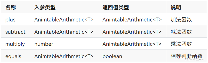
2. @AnimatableExtend定义的函数参数类型必须为number类型或者实现 AnimtableArithmetic<T>接口的自定义类型。
3. @AnimatableExtend定义的函数体内只能调用@AnimatableExtend括号内组件的属性方法。
AnimtableArithmetic<T>接口说明
对复杂数据类型做动画,需要实现AnimtableArithmetic接口中加法、减法、乘法和判断相等函数。
7.2 使用场景
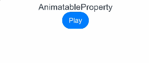
以下示例实现字体大小的动画效果。
@AnimatableExtend(Text) function animatableFontSize(size: uiltin">number) {
  .fontSize(size)
}

@Entry
@Component
struct AnimatablePropertyExample {
  @State fontSize: uiltin">number = 20
  build() {
    Column() {
      Text("AnimatableProperty")
        .animatableFontSize(this.fontSize)
        .animation({duration: 1000, curve: "ease"})
      Button("Play")
        .onClick(() => {
          this.fontSize = this.fontSize == 20 ? 36 : 20
        })
    }.width("100%")
    .padding(10)
  }
}
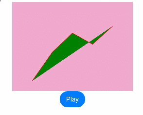
以下示例实现折线的动画效果。
class Point {
  x: uiltin">number
  y: uiltin">number

  constructor(x: uiltin">number, y: uiltin">number) {
    this.x = x
    this.y = y
  }
  plus(rhs: Point): Point {
    return new Point(this.x + rhs.x, this.y + rhs.y)
  }
  subtract(rhs: Point): Point {
    return new Point(this.x - rhs.x, this.y - rhs.y)
  }
  multiply(scale: uiltin">number): Point {
    return new Point(this.x * scale, this.y * scale)
  }
  equals(rhs: Point): uiltin">boolean {
    return this.x === rhs.x && this.y === rhs.y
  }
}

class PointVector extends uiltin">Array<Point> implements AnimatableArithmetic<PointVector> {
  constructor(value: uiltin">Array<Point>) {
    super();
    value.forEach(p => this.push(p))
  }
  plus(rhs: PointVector): PointVector {
    let result = new PointVector([])
    const len = Math.min(this.length, rhs.length)
    for (let i = 0; i < len; i++) {
      result.push((this as uiltin">Array<Point>)[i].plus((rhs as uiltin">Array<Point>)[i]))
    }
    return result
  }
  subtract(rhs: PointVector): PointVector {
    let result = new PointVector([])
    const len = Math.min(this.length, rhs.length)
    for (let i = 0; i < len; i++) {
      result.push((this as uiltin">Array<Point>)[i].subtract((rhs as uiltin">Array<Point>)[i]))
    }
    return result
  }
  multiply(scale: uiltin">number): PointVector {
    let result = new PointVector([])
    for (let i = 0; i < this.length; i++) {
      result.push((this as uiltin">Array<Point>)[i].multiply(scale))
    }
    return result
  }
  equals(rhs: PointVector): uiltin">boolean {
    if (this.length != rhs.length) {
      return false
    }
    for (let i = 0; i < this.length; i++) {
      if (!(this as uiltin">Array<Point>)[i].equals((rhs as uiltin">Array<Point>)[i])) {
        return false
      }
    }
    return true
  }
  get(): uiltin">Array<Object[]> {
    let result: uiltin">Array<Object[]> = []
    this.forEach(p => result.push([p.x, p.y]))
    return result
  }
}

@AnimatableExtend(Polyline) function animatablePoints(points: PointVector) {
  .points(points.get())
}

@Entry
@Component
struct AnimatablePropertyExample {
  @State points: PointVector = new PointVector([
    new Point(50, Math.random() * 200),
    new Point(100, Math.random() * 200),
    new Point(150, Math.random() * 200),
    new Point(200, Math.random() * 200),
    new Point(250, Math.random() * 200),
  ])
  build() {
    Column() {
      Polyline()
        .animatablePoints(this.points)
        .animation({duration: 1000, curve: "ease"})
        .size({height:220, width:300})
        .fill(Color.Green)
        .stroke(Color.Red)
        .backgroundColor('#eeaacc')
      Button("Play")
        .onClick(() => {
          this.points = new PointVector([
            new Point(50, Math.random() * 200),
            new Point(100, Math.random() * 200),
            new Point(150, Math.random() * 200),
            new Point(200, Math.random() * 200),
            new Point(250, Math.random() * 200),
          ])
        })
    }.width("100%")
    .padding(10)
  }
}
